The Challenge
We were approached by M4FF to create:
- A branding that would be contemporary and modern yet classic, elegant and solid.
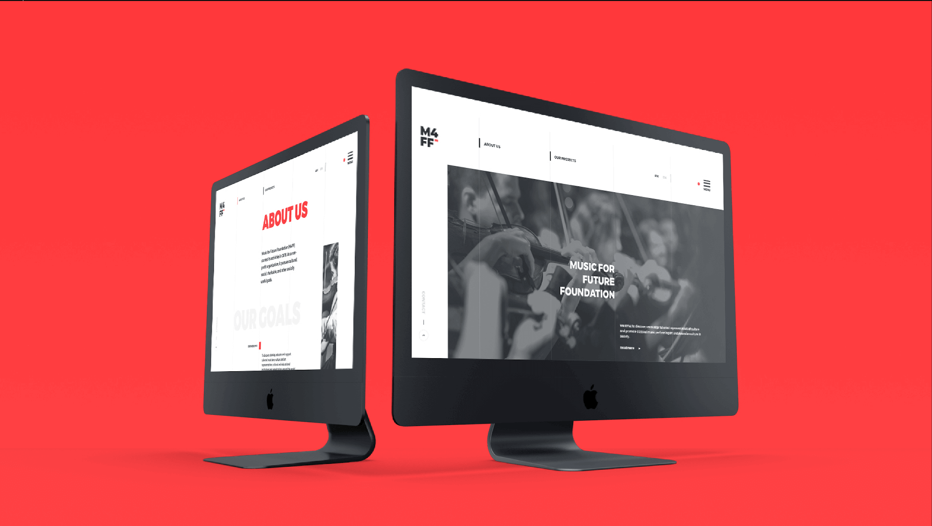
- A website that would communicate brand concept and philosophy in a comprehensive way, present full information on scholarship projects, past winners and their success stories, as well as offer donation possibilities.
- An easy-to-use admin panel for the News Section and Gallery.
Branding
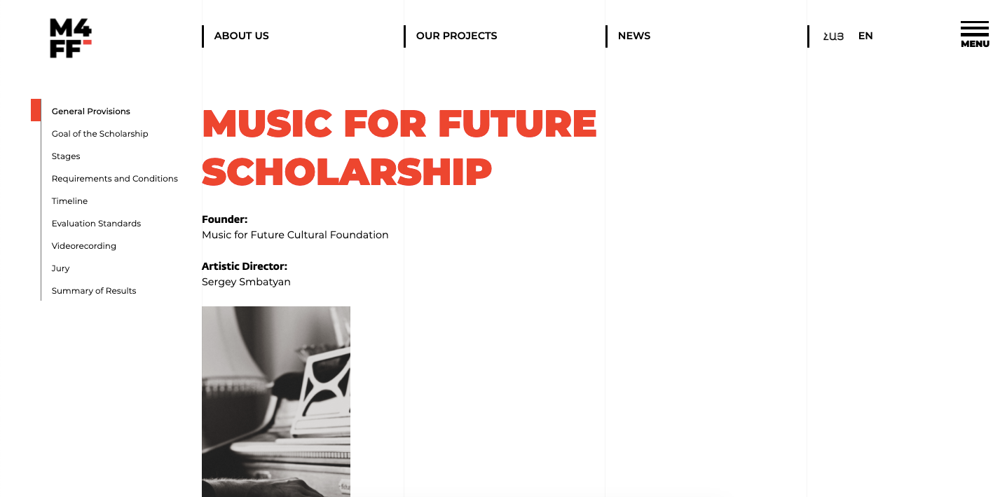
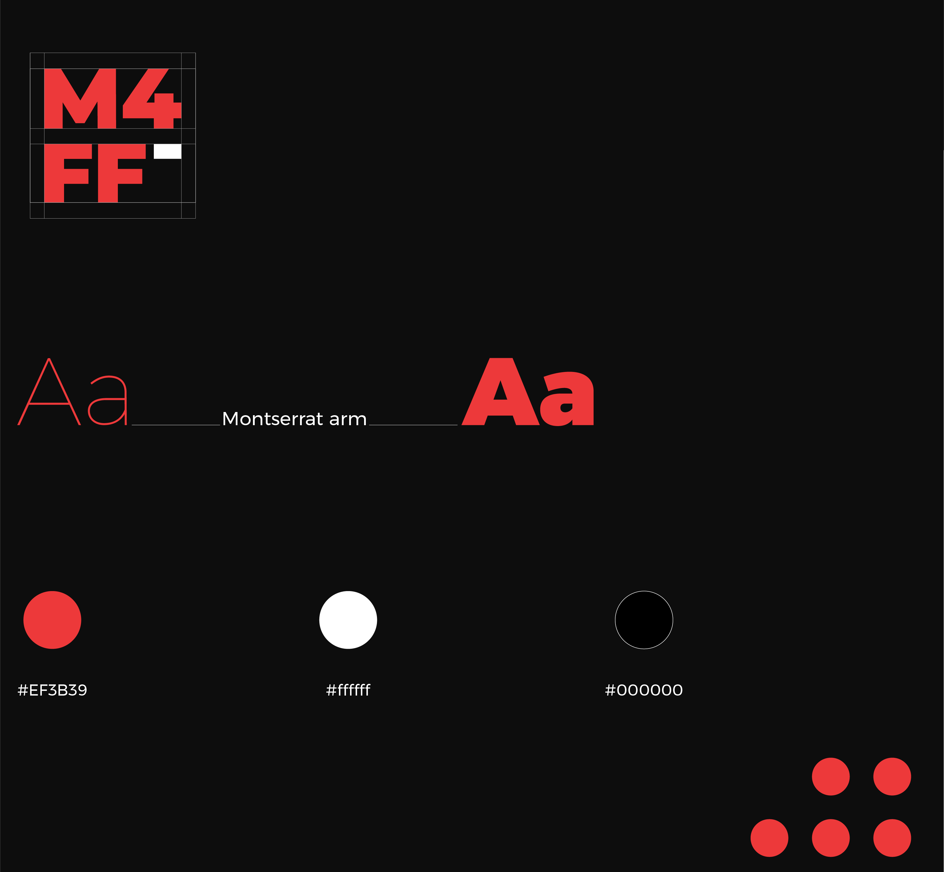
The idea behind is to express growth, knowledge and continous development in music, The brand colors were selected as a classic combination that has a trendy and contemprorary fell
Animations
On hover animations, cursor animation and menu animation were designed to provide smooth transitions, draw attention to clickable sections, and provide enhanced user experience.
Scroll Menu
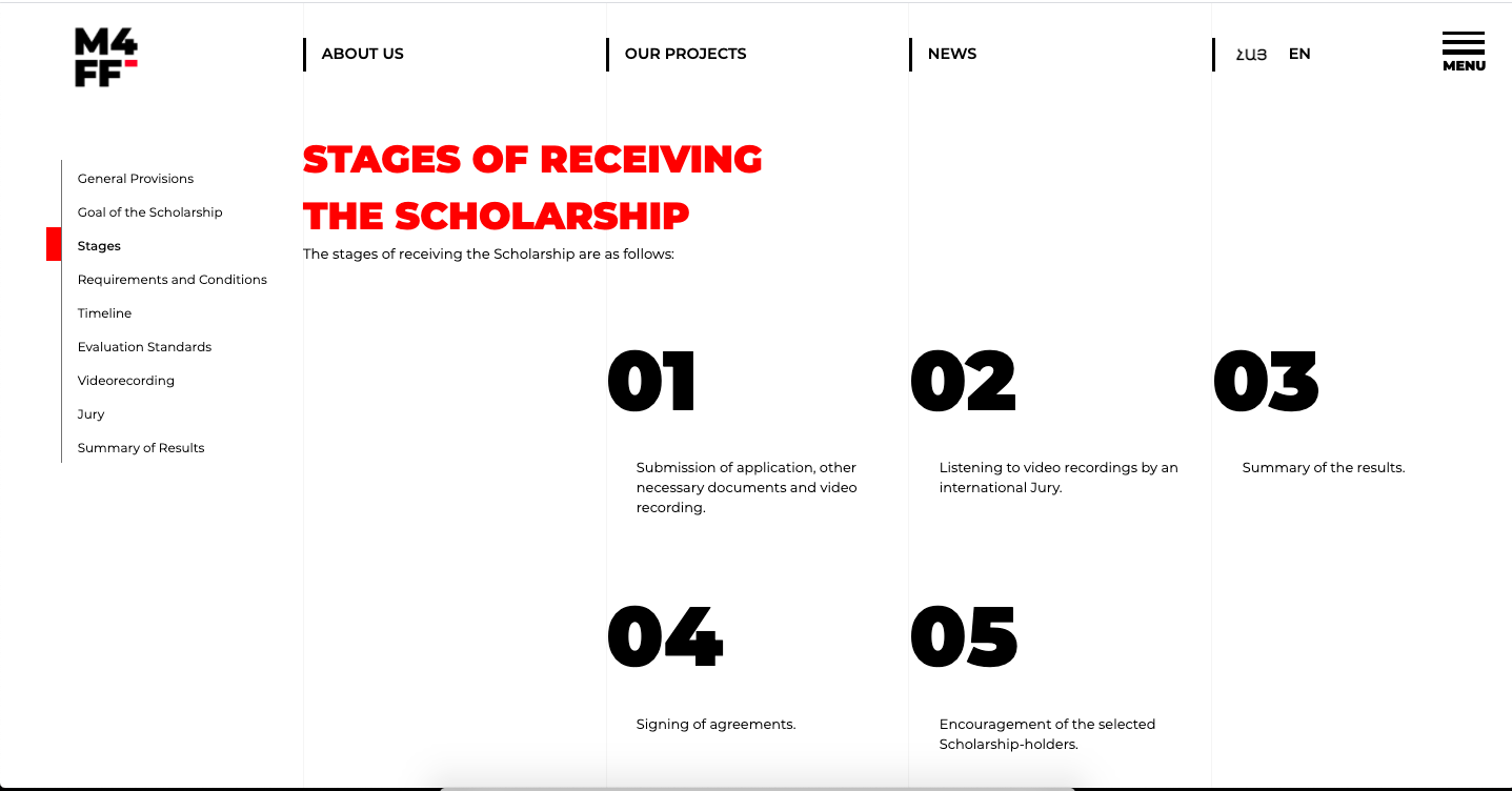
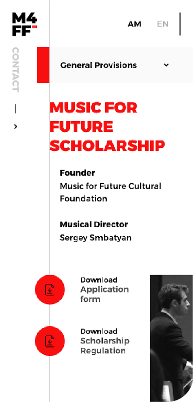
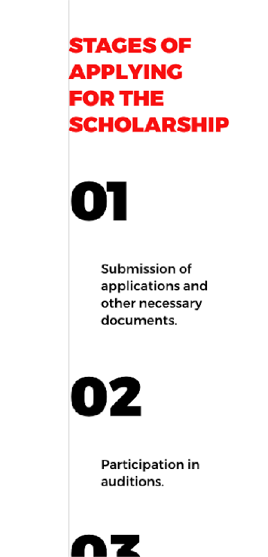
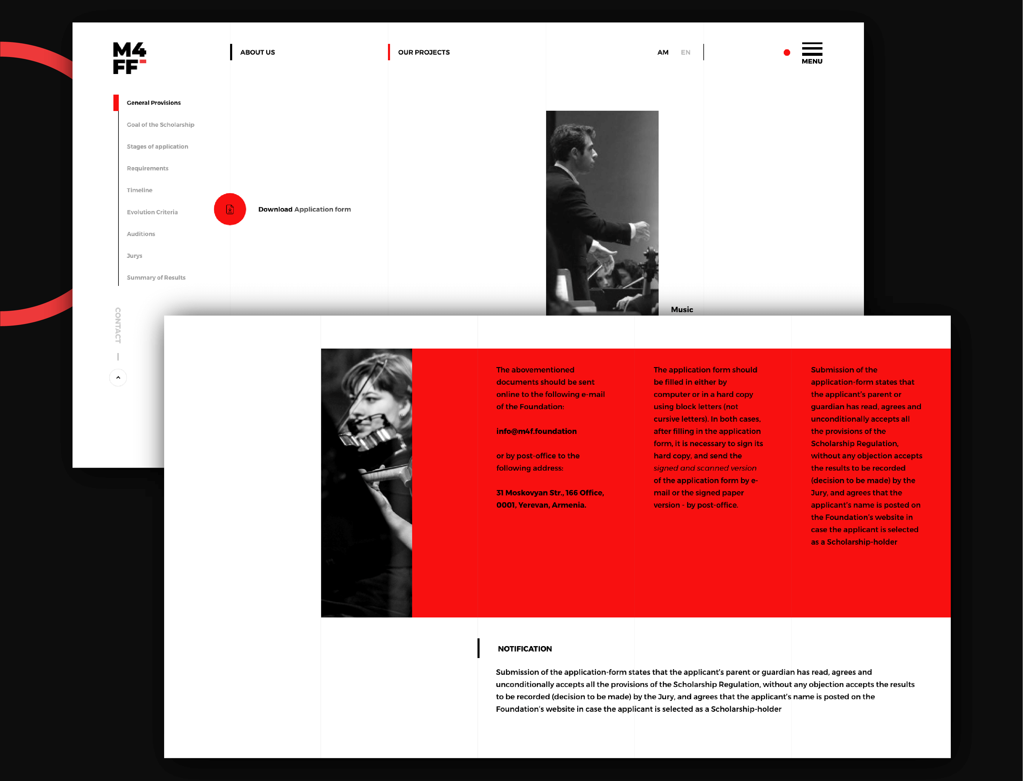
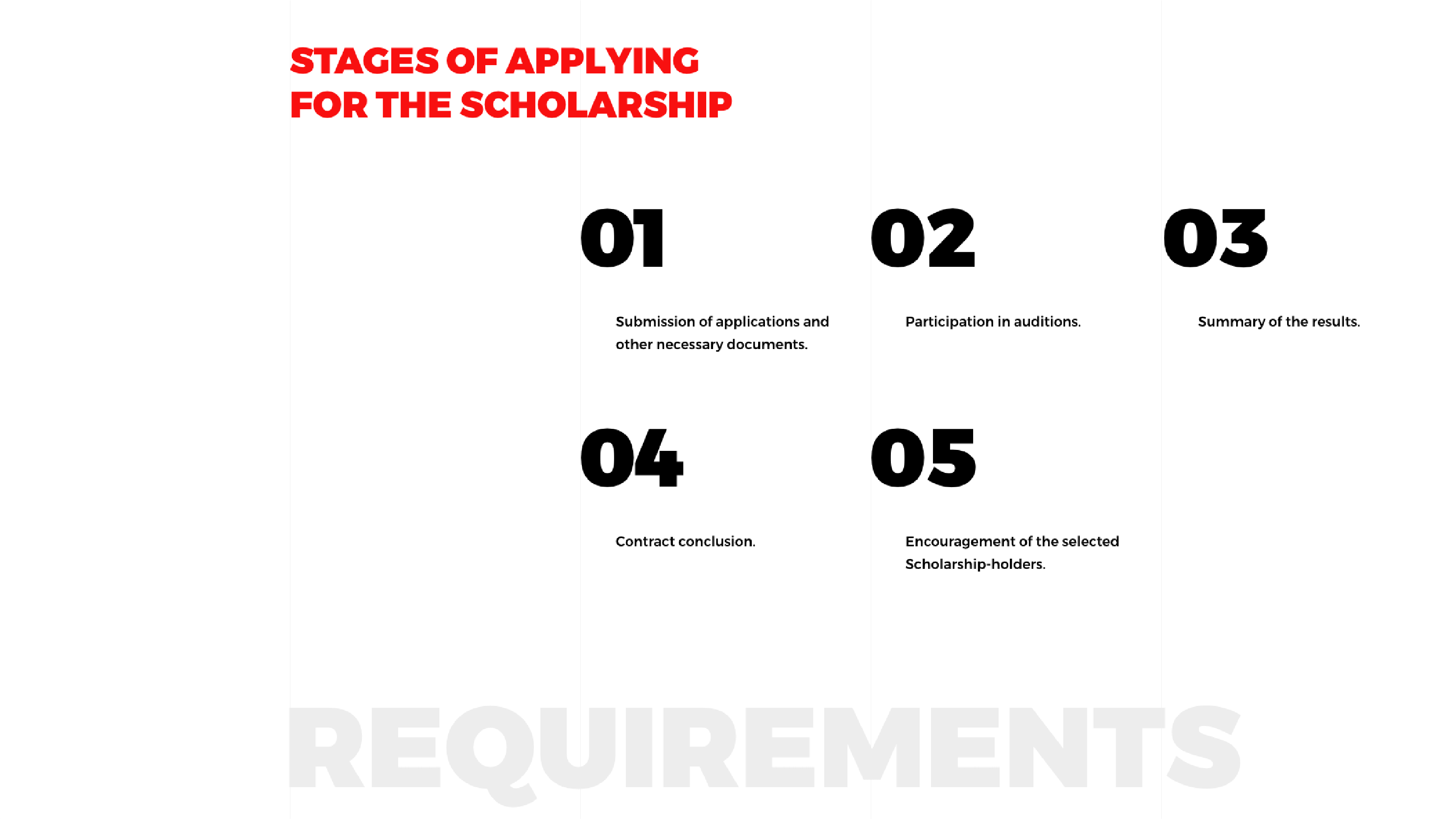
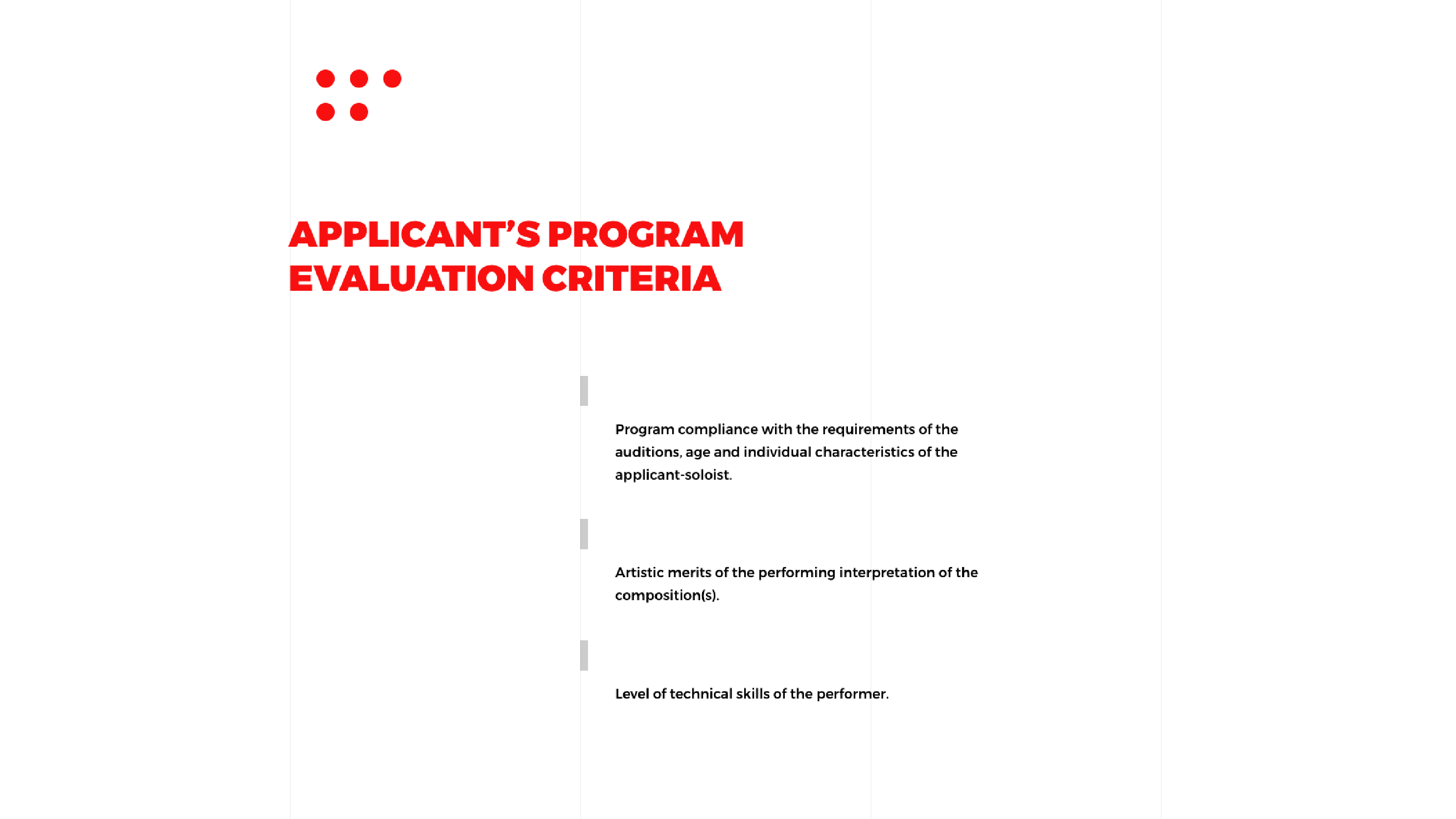
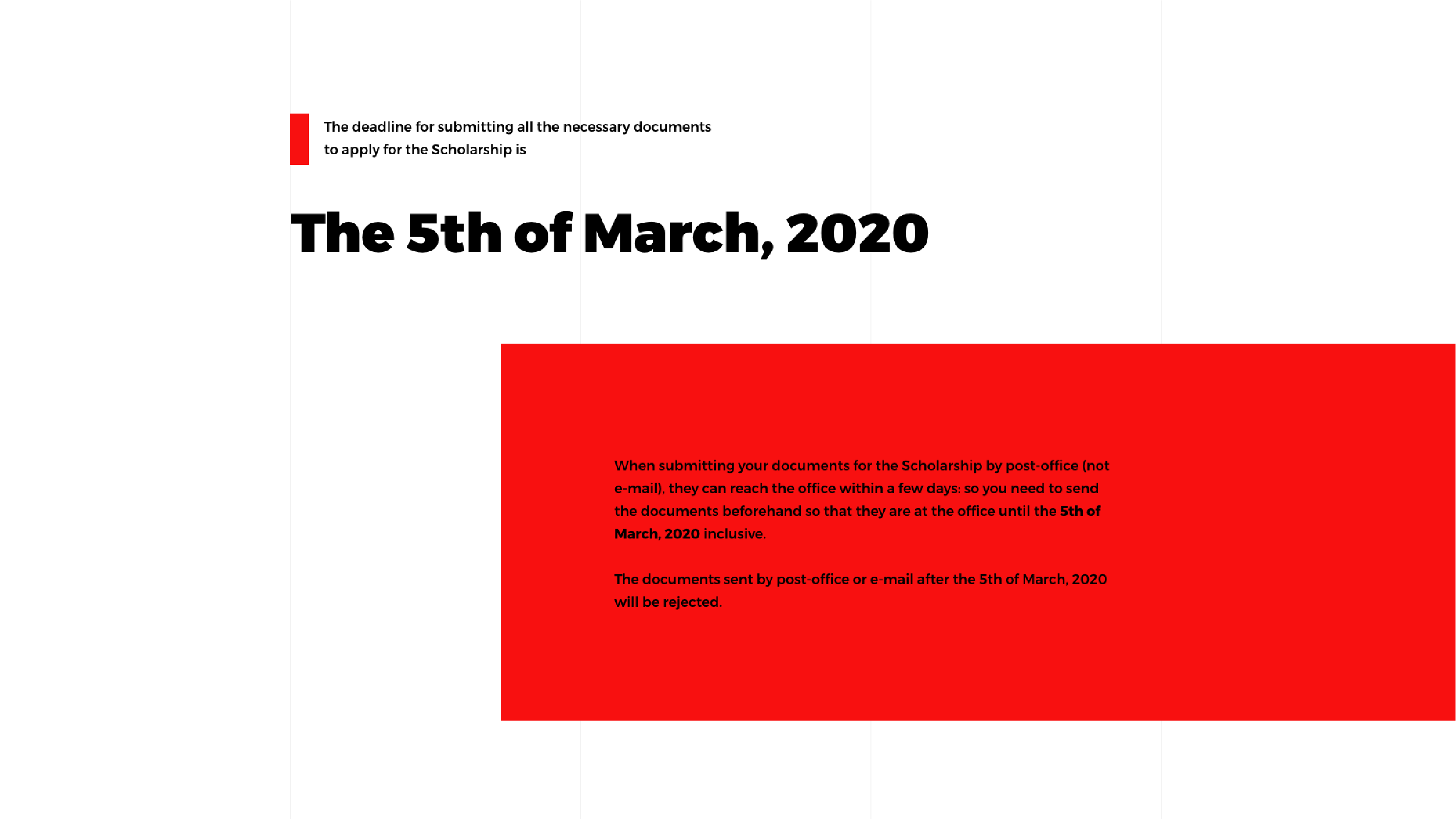
Our Projects page presents all the requirements, terms and conditions of the scholarship program and the details regarding the application process. So, the page was heavy in terms of content and required a solution that would make navigation more user-friendly and intuitive. Therefore, we implemented a Scroll Menu that allows users to jump to their preferred section and shows their current location in the Scroll Menu.
Admin Panel
Our team created a simple, easy-to-use and functional admin panel for the News Section and Gallery in accordance with Material Design guidelines. The admin panel features a simple and elegant interface and intuitive design to enable admins to easily create, edit and delete news, drag and drop images and input links into the gallery, fill in SEO-related data and draw attention to certain pieces of content with the help of Featured News option.
Responsive layout
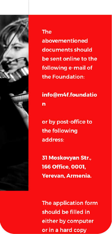
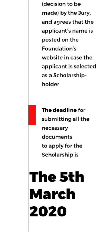
The website is fully responsive. All the pages are designed and developed based on industry best practices, to provide flawless & smooth experience.
